Tuesday, 8 July 2014

Choosers in Windows Phone 8 using Visual Studio 2013

I will assume that you have installed the tools for working like Visual Studio 2012 ( or 2013 ) and that you’re on Windows 8 at least ( or 8.1 ) .
You can use Choosers in your Windows Phone applications to enable users to perform common tasks. By using choosers , you help provide a consistent user experience throughout the Windows Phone platform. At the same time, by using choosers , you can distinguish your applications by providing additional functionality such us choosing an email , a phone number , or an address inside the application and much more .
Let’s learn now how to use this great tool  , Go ahead and create a new project , then follow these steps :
The first thing that we will do is to create four buttons in our application , you can write the XAML code or just preform a simple drag and drop , then let’s change the names of our buttons like we did in our previous workshops , and add to each one an new event handler :
1

Now , we will be working on the code behind of each event handler we already created , let’s start with the first one which is the Adress Chooser  :

This choosers will help us find the adress of each contact we have in our Windows Phone in order to use it inside your application for another feature , of course the contact you have chosen have to be a contact that already written his adress into his account , of course we will need the namespace of Tasks like we did in the workshop of launchers :
We will create an object of type AdressChooserTask and a new event to show in a MessageBox what’s the contact you have chosen
2

Let’s move now to the next chooser which is the camera capture . For example if you want to add a feature of taking a picture inside your application you will need to use this chooser to give the user a simple way to open the camera without leaving the application , we will create an object of type CameraCaptureTask :
3

Another important Chooser is the Email Chooser , you will be able to give your user the ability to choose an email of a contact in order to send him an email via the application for example , we will use now an object of type EmailAddressChooserTask :
4


Let’s move to the last chooser of our workshop which is the Phone Number chooser , your user can choose a contact and find its number ( if it’s added of course ) and use inside the application , our object now will be a PhoneNumberChooserTask :
5

There are other choosers that might be helpful for you in your application but I’ve chosen these one because they are the most common ones and we will use them in our next workshop to develop our first applicaiton together . You can find other choosers in MSDN here in this link .
Please note that the Camera chooser will not work on the emulator of course . Here are some screenshots of our workshop tested on a Nokia Lumia 920 :
wp_ss_20140215_0015[1]


wp_ss_20140215_0016[1]

wp_ss_20140215_0018[1]

wp_ss_20140215_0019[1]

wp_ss_20140215_0019[1]

Launchers in Windows Phone 8 using Visual Studio 2013

I will assume that you have installed the tools for working like Visual Studio 2012 ( or 2013 ) and that you’re on Windows 8 at least ( or 8.1 ) .
You can use Launchers in your Windows Phone applications to enable users to perform common tasks. By using Launchers, you help provide a consistent user experience throughout the Windows Phone platform. At the same time, by using Launchers, you can distinguish your applications by providing additional functionality.
Let’s learn now how to use this great tool  , Go ahead and create a new project , then follow these steps :

First thing that we will do is something that we’ve already done in the previous workshops ,let’s make our grid with 3 rows and 2 columns .

1

The Grid will look like this :
2

It’s time to add our buttons now just like how we did in a previous workshop , let’s follow some best practises and name them like this and add the event handlers :
3

We  will add now the code behind for each event :
Let’s start with our first launcher : WebBrowserTask
This launcher will help us open the browser in the Windows Phone , but make sure to add the namespace Microsoft.Phone.Tasks; be fore starting
4

The code for the WebBrowserTask is :
5

Let’s move now for the PhoneCallTask which is a launcher to make a phone call from the application :
We need to check a capability for this in the Manifest file : Id_Cap_PhoneDialer
7
Now we can add some C# code for the event :
6

Let’s try now another launcher which is EmailComposeTask :
This launcher will help us send an email via the linked inbox in the Windows Phone through the application
8You can see that I’ve added the reciever , subject and my other email , you can get these parameters from textboxes if you want in your application
What about getting ratings for your application ? Yes it matters , and therefore we can use a launcher to help the user rate our application inside it not forcing him to leave it .
We will use the MarketPlaceReviewTask :
9

And what if you want to promote your other applications in the store for your user ? In fact yes you can , just another launcher , as simple as that :
Let’s use the MarketPlaceSearchTask :
10

And if you’re using internet connection in your application and you want to redirect your user to the WiFi settings without leaving the application , just use another launcher which is : ConnectionSettingsTask

11

Let’s explore now some results of our launchers from these screen shots :
wp_ss_20131226_0007[1]

wp_ss_20131226_0008[1]

wp_ss_20131226_0009[1]


wp_ss_20131226_0010[1]

wp_ss_20131226_0011[1]

wp_ss_20131226_0012[1]

You can now save your work and run the project , please note that the EmailComposeTask and MarketPlace launchers won’t work on the Emulator

StackPanel Control in XAML

Like the Grid, the StackPanel is a layout control. Unlike the Grid, which requires you to declare the number of rows and columns initially, the StackPanel is used to lay out its contained controls in a linear manner across either a vertical or horizontal plane—one after another until they are all displayed.
The StackPanel has the advantage of being a bit simpler to use than the Grid because the developer does not have to declare the position of each control. This may seem trivial, but in cases where the potential exists for a grid with even as little as tens of rows and columns, the act of inserting a new control or controls somewhere in the middle (or even the beginning, for that matter) of the layout requires updating the RowDefinitions or ColumnDefinitions property of the Grid as well as the Grid.Row or Grid.Column property of each control that is being displaced by the addition of the new control. This makes StackPanel ideal for situations that don’t have the layout requirements to make using a Grid necessary.

These are some properties that are commonly specified for a StackPanel control:

• Height and Width: These properties control the size of the container. If these properties
are not specified by the page author, the control will size itself appropriately to contain
all of its content. When Height or Width is specified, any content that would push beyond
these bounds is clipped and not displayed.

• Background: This property controls the Brush that is used for the background of the control.

• DataContext: This property does not impact the way the control looks but can be
important when used with data binding, which I will discuss in a later chapter.

• Orientation: This property controls whether the StackPanel expands along a vertical
plane, which is its default, or along a horizontal plane.

Because StackPanel does not require the type of layout declaration needed by Grid, placing a StackPanel onto a page is as easy as using the following XAML:

<StackPanel Background="White" Orientation="Vertical">
</StackPanel>

I’ve included Orientation = "Vertical" in the XAML to make the orientation clear to the user, but because Vertical is the default value, it doesn’t necessarily have to be specified at all in this case. To arrange controls within the StackPanel, we simply include them in the XAML between the
< StackPanel > </StackPanel > tags, as in the following XAML:

<StackPanel Background="White" Orientation="Vertical">
           <TextBlock Text="Text Block 1" FontFamily="Segoe UI" FontSize="24" />
           <TextBlock Text="Text Block 2" FontFamily="Segoe UI" FontSize="24" />
           <TextBlock Text="..." FontFamily="Segoe UI" FontSize="24" />
           <TextBlock Text="Text Block 100" FontFamily="Segoe UI" FontSize="24" />
</StackPanel>

The controls will then be laid out in the order that they appeared in the XAML, as in Figure

                                      --->StackPanel with Vertical orientation

By changing Orientation = "Vertical" to Orientation = "Horizontal", you change the flow of the display
and end up looking more like Figure

                                   -->StackPanel with Horizontal orientation

One very common usage pattern for StackPanel is to nest StackPanel instances within another StackPanel, often using different orientations. For example, if I wanted to create a data entry form, I might use the following:

XAML to achieve the result shown in Figure:

<StackPanel Background="White" Orientation="Horizontal">
           <StackPanel Orientation="Vertical" Margin="5">
                      <TextBlock Text="Last Name" FontFamily="Segoe UI" FontSize="24" />
                      <TextBox />
           </StackPanel>
           <StackPanel Orientation="Vertical" Margin="5">
                      <TextBlock Text="First Name" FontFamily="Segoe UI" FontSize="24" />
                      <TextBox />
           </StackPanel>
</StackPanel>
                                          --->Nested StackPanels


Monday, 7 July 2014

creating a simple round button in MS VS Blend 2013


Open Microsoft Visual Studio Blend 2013 and create a Windows Phone Blank Silverlight App.
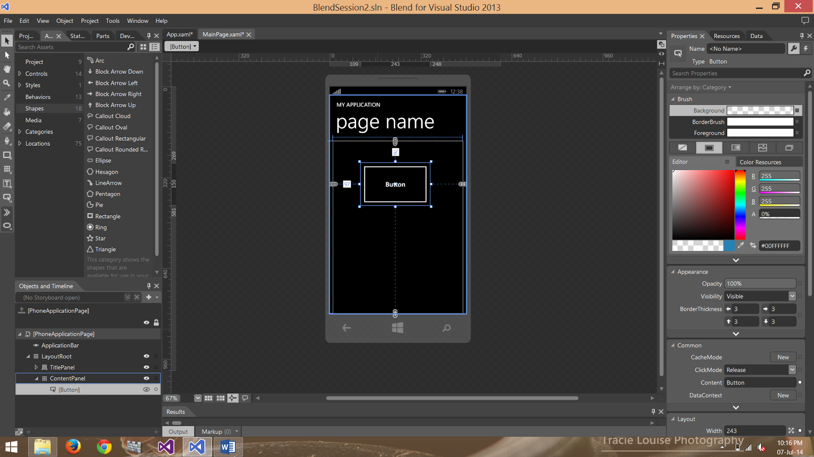
In the MainPage.xaml design select the button as shown in figure:


Now draw the button as shown in figure:


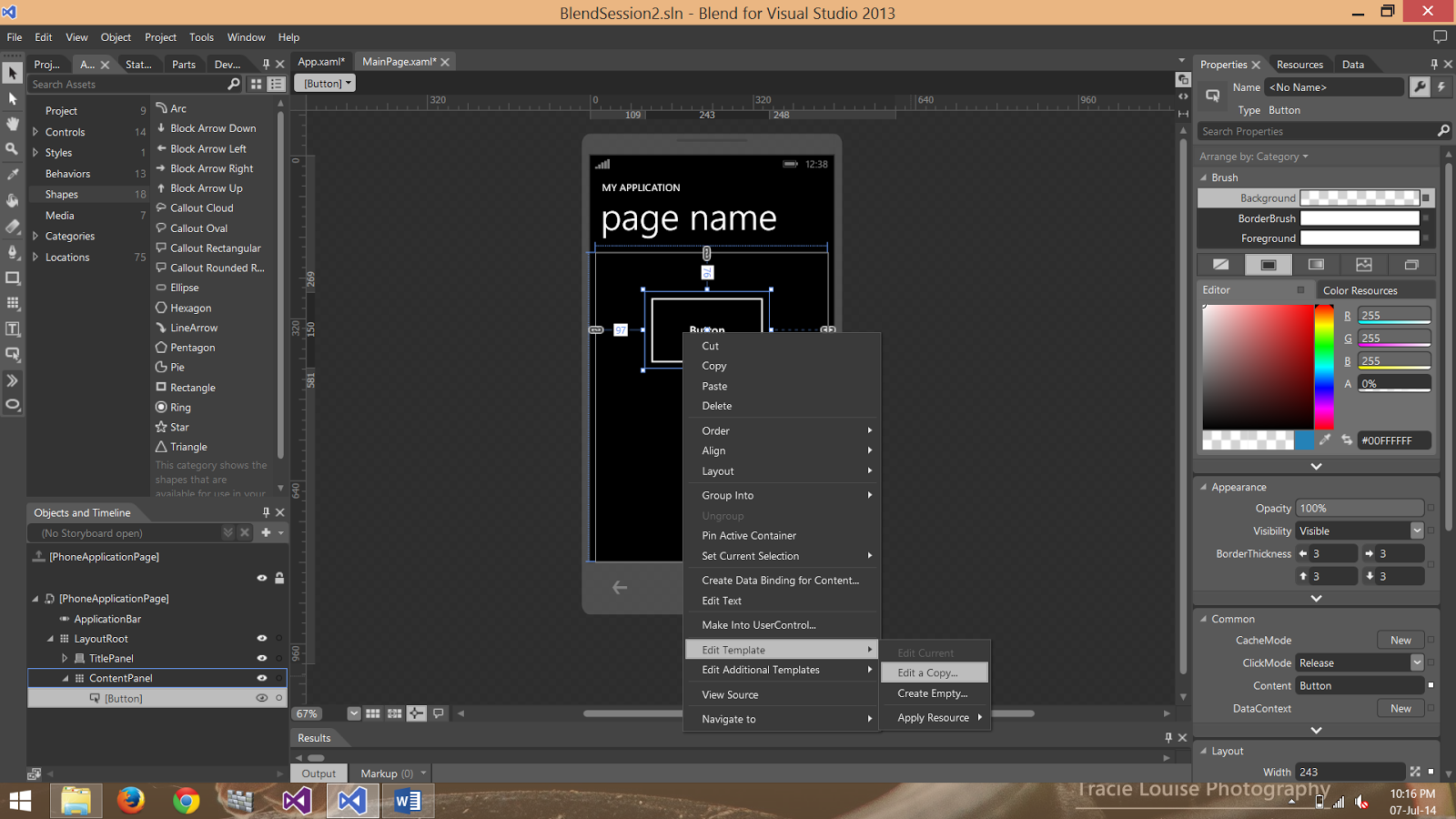
Select button and right click the mouse and from the list select edit template and select edit a copy as shown in figure:


After selecting this option you see the following screen:


After pressing ok you see the following screen:


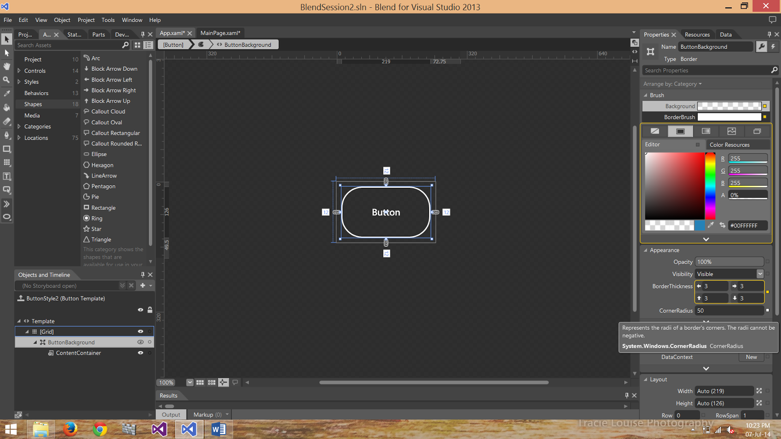
On the left side of the screen you see the Appearance and in the cornerRadius write 50 instead of 0.
Now you see the round corner button as shown in figure:


On the right side of the screen click on the option where the mouse arrow is shown in figure:


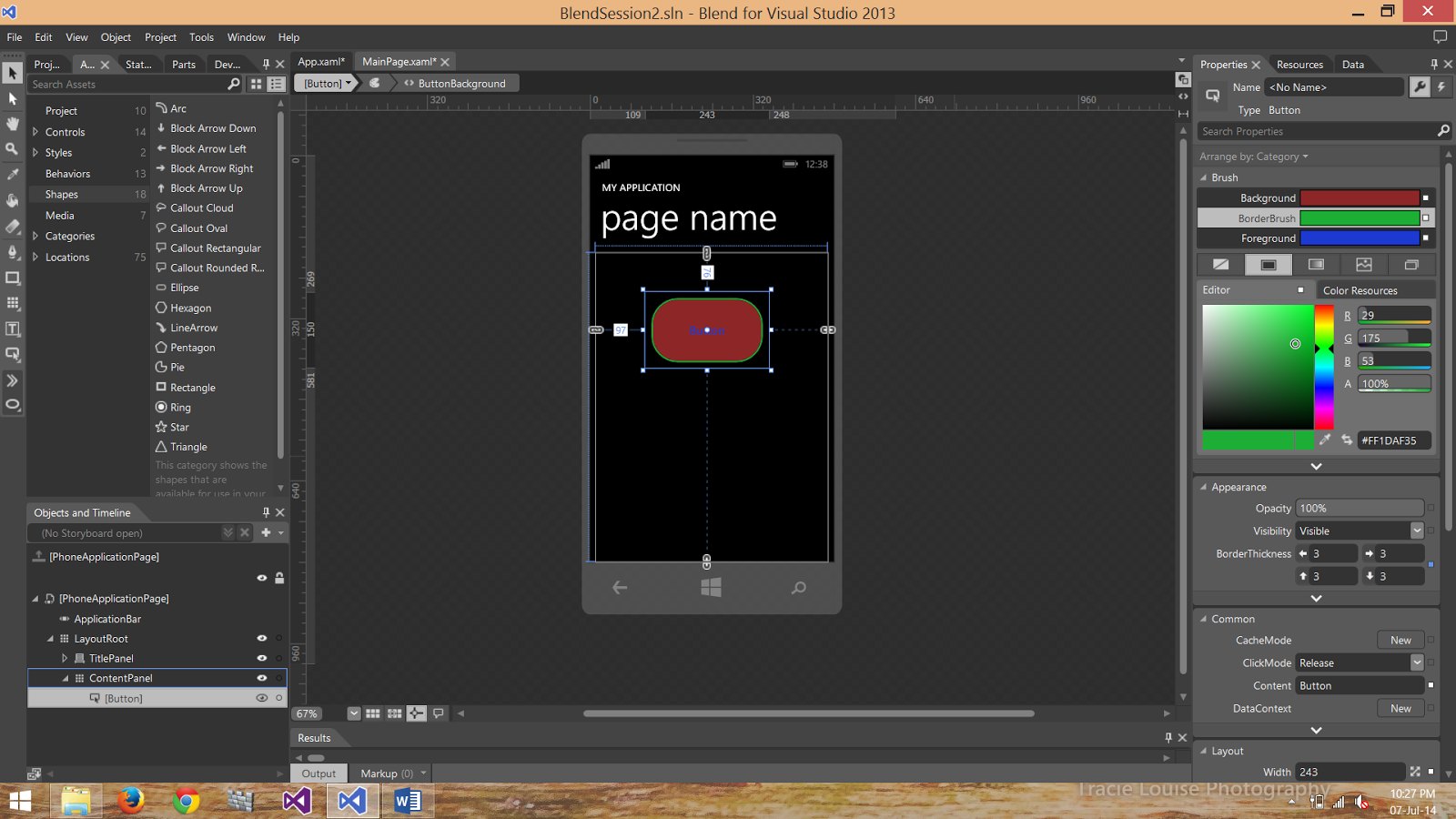
After applying this you see that the original button is changed also as shown:


From the right side of the screen we can also change the Background, Foreground and BorderBrush color too as shown in figure:


You can also create all this effects by using XAML.

Description of Pen,Gradient tool and combining different shapes by using MS VS Blend 2013

Create a simple Windows Phone Silverlight Blank App in Microsoft Visual Studio Blend 2013.
On the right side of the screen click on the Assets and then select shapes from the list given.Now you will see the following menu:

From the shapes select the rectangle and draw two rectangle on the Mainpage.xaml design and change the color of both rectangles. You will see the following screen:

Select both rectangles and right click the mouse button and from the list select combine option as shown in the following screen:

We get the following options:
1 – Unite
2 – Divide
3 – Intersect
4 – Subtract
5 – Exclude overlap

By selecting the Unite option we get the following result:

By selecting the Divide option we get the following result:

By selecting the Intersect option we get the following result:

By selecting the Subtract option we get the following result:

By selecting the exclude overlap option we get the following result:

Now delete both of the rectangles and select the Pen tool from the tool menu as shown in fig:

Pen tool is used for drawing different shapes for example if we want to make grass we can use the pen tool. For example if you put three points using the pen tool it will draw a triangle as shown in the following figure:

Gradient tool is used to produce a shining and many other effects in the shapes we have. Select the gradient tool from the tool menu as shown in figure:

After selecting the gradient tool we select the shape to which we want to apply the gradient and when we click the left mouse click and start moving the mouse we see the following arrow:

As we rotate the arrow we see the different effect. After applying the gradient we see the following effect:


By using these tools we can draw different shapes and icons we want.